Colour trends 2026: sublimating Geneva interiors
Are you feeling the change in atmosphere? After years dominated by the minimalism of «all grey» and aseptic interiors, 2026 marks a decisive turning point. It's time to reclaim the light and affirm a new optimism at the heart of the home.
Far from the dictates of fleeting fashions, we analyse this fundamental movement for you. Find out how to warm up your spaces with a lively palette inspired by sunlight and materials, and adapted to the particular luminosity of the Lake Geneva region.
2026: The year of solar optimism
If we take our inspiration from the major current trends (such as the «True Joy» movement), the conclusion is clear: our interiors are thirsting for vitality. But don't go painting your walls in aggressive primary colours.
The 2026 trend is defined by enveloping warmth. This is reflected in the arrival of shades that capture and diffuse natural light:
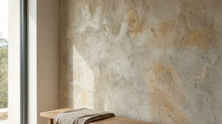
- Solar and spicy tones: Soft ochres, terracotta shades and golden sands. These shades counter the winter greyness so common in Geneva.
- The new neutrals : Concrete grey gives way to warm greiges (a mixture of greys and beiges) and off-whites pigmented with a hint of clay. They provide a soothing yet lively backdrop.
Technical expertise in colour (NCS and RAL)
To make this transition a success, there's no room for approximation. As painters, we work with precise references that guarantee the right tone on your walls.
The NCS system for the perfect shade
We use the Natural Color System (NCS) to refine your choice. This system allows us to play with saturation and luminosity.
- A concrete example: Do you like the idea of a «sun-kissed» shade? With the NCS colour chart, we can find exactly the shade that contains enough warm pigments to be user-friendly, without tipping over into an overly bright orange that would bore the eye.
Harmonious joinery (RAL)
The 2026 trend also plays on contrasts. Instead of standard white doors and skirting boards, we're exploring lacquers. RAL in corded or contrasting tones (deep brown, olive green) to emphasise the architecture of your rooms and give character to the volumes.
Beyond painting: the return of matter
A colour, no matter how beautiful, remains flat if it doesn't catch the light. For 2026, the trend is towards surface vibration.
This is where our expertise in decorative coatings comes into its own:
- Lime and mineral effects : They add natural depth. The light doesn't just bounce off the wall, it plays with the grain of the material.
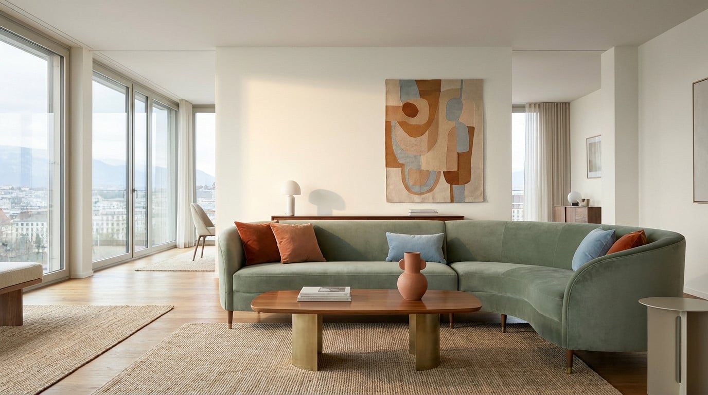
- Velvety matte : For classic paints, we prefer matt or velvet finishes. They absorb light to create a cosy, cocoon-like atmosphere, which is highly sought-after for bedrooms and living rooms.
The challenge of Geneva's light
Why insist on professional advice? Because a colour is only as good as the light that illuminates it. In Geneva and the canton of Vaud, the light changes drastically between summer and winter days. A colour that looks warm in the catalogue can turn dull once it's applied if it hasn't been tested.
Our method: in situ sampling. We never rely solely on a paper label. We make real samples on your walls. This is the only way we can confirm how these new solar shades react to your exposure (North/South) and your artificial lighting.
FAQ - Advice Couleurs 2026
Do I have to repaint my entire room to keep up with the trend?
Absolutely not. The 2026 trend works very well in zoning. Sometimes it's enough to treat an accent wall, a niche or a headboard with a sunny or spicy hue to liven up the whole room, while keeping the other walls in soothing neutrals.
Is grey definitely out of fashion?
Cold, clinical greys are on the wane. It is being replaced by warm greys, tinged with brown or yellow (the famous «greiges»). These shades retain the timeless elegance of grey, while at the same time bringing the conviviality that was missing from previous interiors.
How do I know if a «trendy» colour will work in my home?
This is the role of the craftsman. We analyse your volumes, your existing furniture and above all the orientation of your windows. An ochre tint will be magnificent in a north-facing room to compensate for the lack of sunlight, while a south-facing room will support softer, less saturated colours.
What finish should you choose for a cosy living room?
Choose mat or the velvet. Unlike satin, which reflects the light and can give a «plastic» appearance, matt offers a powdery, high-end finish. If you want to go one step further, a lime coating is the ideal option for combining colour and natural texture.